|
By Sandy Hershelman
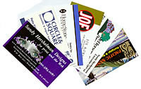
Your business card is one of the most effective pieces
of advertising in your arsenal. At least, it should be. A business
card really must stand out to do its job well. . .and face it, few
do.
People remember clever people. Put quality time into developing your
business card and it will serve you well. Your number one goal is
to have a potential client keep the card handy and then use it to
make contact.
Business cards are as individual as are the people who carry them.
My card is bold and colorful, as is my personality and the nature
of my business—print and Web design. A lawyer, on the other
hand, may choose a more traditional style of embossed black letters
on fine white cardstock.
Collect cards you like. Identify their strengths and weaknesses.
Use that information, as you consider your own card.
Beware of homemade cards: If your business card looks cheap and tacky,
people will expect your services to be likewise. The nubbins on perforated
cards are bad news, and inkjet printer ink runs if it gets wet. Not
good.
All business cards should include the basics: your name, title (if
relevant), business name and logo, phone, fax, address, e-mail and
Web site. If you don't want people stopping in at your home
office, don't put your address on the card. If you only get
a couple of faxes a month, don't waste the space including
that number on the tiny card.
If you change phone number or address, make new cards your top priority.
Scribbled-out info on a card demonstrates an inattention to detail.
Include a tagline, or unique selling proposition, that tugs on the
emotions, such as "We build your dreams!" or "Strengthening
family ties since 1912."
Photos work. Ask any Realtor. Including a headshot on your card provides
a familiarity even before you meet the new client.
When designing a card, make sure the ink is dark enough to stand
out on the paper you choose. Quality cardstock is always a winner.
Vellum (that cool see-through "paper") makes unique cards.
Photo paper offers an unexpected effect, but it's hard to write
on.
Avoid hard-to-read fonts. They become even more illegible the smaller
they get. Beware of going too small with any font, especially if
your clientele is over 40. Can Mom read it at arm's length?
There is a whole psychology to color. Color evokes emotions. Emotions
drive decisions. Warm colors excite (red, orange, yellow); cool colors
(violet, blue, cyan, sea green) can be calming, peaceful and therapeutic—or
induce sadness. Men often see blue as a solid, reliable color. Many
women consider it businesslike, yes, but depressing. Who is your
audience? What message are you sending?
Budget considerations? Use one color of ink on a standard stock.
Or, use various shades of the same color ink to create a multicolored
card for a one-color price. Use impressive, yet readable lettering.
Embossing is a cost-effective, and classy, option.
Oversized cards don't fit into wallets and business card holders.
Vertical cards don't staple well onto Rolodex cards, but yes,
they do make vertical business card holders. Bottom line: You want
your card to be kept.
It doesn't cost much more to print on the back of the card,
too. I first ventured onto the backside of my card, when I designed
a bold and colorful card that featured my eyes in a logo. I knew
it would bring oohs and aahhs, but the design left no space to specify
my business marketing services.
You could also use the back of the card as an appointment card, offer
a solid piece of advice, or even add a tasteful joke or bizarre fact.
There is a catch: Most people aren't yet trained to look on
the back of cards. I find myself telling them my services are on
the back—then they flip it over.
The next reincarnation of my card will be a folded card: 3.5 x 4.0625
inches folded to the standard 3.5 x 2 inches. Think of it as a mini-brochure.
One could even perforate the fold and use one half of the card as
a coupon or referral card.
Have cards made for your staff and encourage them to use them. They'll
hand them out to your customers, their friends, and at social gatherings.
You build employee self-esteem and reap the rewards of word-of-mouth
advertising. It's a win-win.
A money-saving tip: Your printer can print up a bazillion of your
standard, full-color cards with no employee name. Add staff names
to those cards, in smaller batches, as needed.
Make sure your business associates and devoted clients have a small
supply of your cards. Fortifying a referral with the pass of a card
increases the chance of contact.
If you're unemployed and looking for work, make sure you always
have business cards on you. Use the backside to print a short bio
with your qualifications.
Please, please, please. . .pitch the icky cards with the dog-eared
corners. Don't even be tempted to hand one out.
If you regularly encourage referrals, by handing out your card
in twos and threes, you should go through them rather quickly.
Take
each reprint as an opportunity to reevaluate your business card.
As your business grows and evolves, so should your business card.
|